One request can be multiple commands
… and check why 5600+ Rails engineers read also this
One request can be multiple commands
It took me many years to understand the simple truth. One HTTP request sent by a browser may include a few separate logical commands. One request does not always equal one logical command.

If you are already past the mindblown phase like me, it may even sound obvious to you. But it was a bumpy road for me to find the enlightenment.
So why do we send multiple commands in one HTTP request instead of multiple separate requests?
- because of the limitations of non-scripted (no JS) browser form model
- because of how we build UIs
Before I further elaborate let me tell you that it is not inherently bad that we have multiple commands in one request as long as we are aware of it. When we do it consciously and knowing about the pros and cons. And we can also always compensate for it on the backend side.
Native browser form limitations
Browsers always send all fields (except for unchecked checkboxes, but rails workarounds that with hidden inputs) even if they were not changed. This is a blessing when you just want to do a simple DB update. But it makes understanding user intent much harder sometimes because we would need to compare previous and new values (doable and even easy but it requires more effort).
Because we always see all provided attributes, we (developers) don’t think much whether the user intention was to do only X without touching the rest of the fields at all. And maybe 90% of time users only change X and that the X action is quite important and should be a separate, dedicated, explicit command and explicit UI interface.
An example could be a “publish” checkbox. Perhaps publishing (and unpublishing)
is so important that it deserves a dedicated “publish” button and PublishCommand
in your domain. Of course, as always in programming, it depends on many factors.
How we build UIs
We often build our UI as a long list of inputs with one “Save” button at the end. Especially when it comes to less often used parts of our applications. An example could be a page for updating your user settings. Where you can change things such as:
- avatar photo
- cover photo
- password
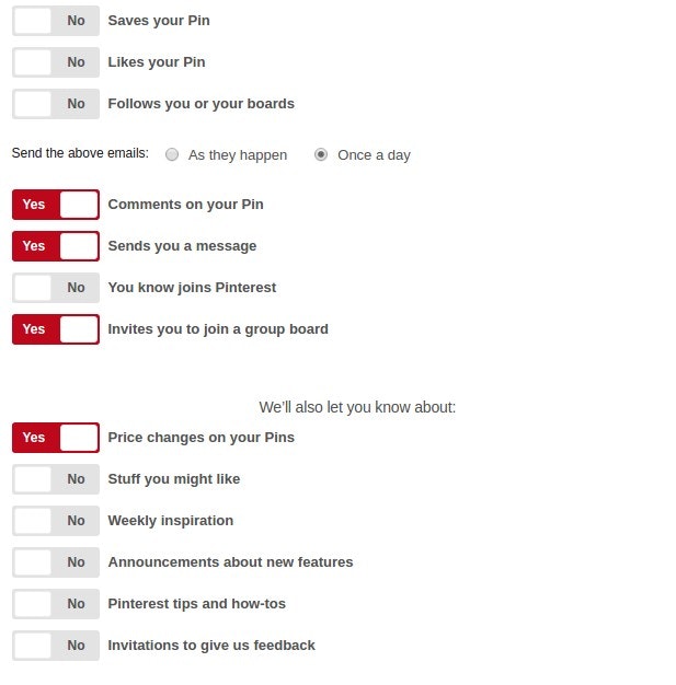
- notification settings
- your personal page path or URL or nickname
- birthday
- privacy settings
- and sometimes many more things as well…
This is often just a long form with a “Save” button.
But not a single person wakes up in the morning thinking hmmm I am gonna change my avatar, and cover and email and password and privacy settings.
It’s much more likely they were browsing the Internet, found something inspiring and decided hmm let’s change my cover photo. Or they were reading Hacker News and Reddit and heard about yet another password leak and decided to update their passwords to something new on many websites. Or they got angry with a push notification and decided to turn it off. Or they decided to get rid of that silly, childish nickname they have been using for years and become more professional so they changed that.
But they don’t come to this page to change everything. We just kind of built such a UI for them because those things don’t fit well anywhere else so we present them together on a “settings” page.
What to do about it?
I think the solution is to go more granular.
If there is a big form in your app think about splitting it into something smaller and more manageable.
The first step that I try to do is to break down the form into multiple separate ones. Each one has its own “Save” button.
So instead of 10 inputs + Save I have for example:
- 3 inputs + Save + divider
- 4 inputs + Save + divider
- 3 inputs + Save + divider
That way you still have everything listed on one page but the user can now update smaller, coherent, meaningful parts without thinking about the rest. The UI indicates (with dividers and grouping) what I am about to update. Today I read an article about how SEO is important so I am updating only the SEO settings of a product.
The next step is to start using JavaScript to improve the usability and intentionality of what the user wants to achieve even more.
For example, if there are fields which don’t depend on anything else, they are completely separate and the cost of change (or revert of the decision) is minuscule maybe we can save the change directly when the user triggers it.
Examples

If setting a new value does not cause huge side-effects and is trivial for user to revert, does it really need a “Save” button?
Or maybe we can send one request which translates to DisableNotificationFor.new("saved_pin")
command?

Grouping allows the user to better specify their intention and only update the specific field they need to change today. They came to your app to perform a certain task.

UI for changing a product in a shop. Options grouped in 14 logical categories.
Conclusion
Just because we received 20 different attributes from one form does not mean we need to construct one command with 20 attributes and pass it to one Service Object. We might construct separate commands for groups of the attributes and pass them further, even to a different Service Objects.
Read more
More about Task based UI